After some interface improvements in my previous post, I added a words card game to the vocabulary trainer app since that.
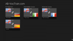
But first I extended the main view with a semantic zoom. Here is the normal view:
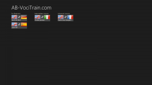
And with semantic zoom (zoomed out):
If there should be many lessons to display the user can get a better overview this way.
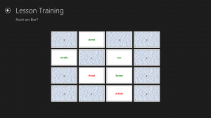
But now the more interesting part: the words card game that looks similar to the game Memory® by Ravensburger:
It displays covered playing cards in the first place. After the user touches/clicks on a card it is uncovered and a word in one of the two languages of the current lesson is displayed. The user then needs to find the translated word for it.
If there are too many words in one lesson to show, the words are picked random automatically.
Here is how that looks like now:
OK, that was the last post in the Ultimate Coder Challenge from me.
Of course, there is still enough things left that could be added to this vocabulary trainer – especially the online sychronization should be available soon -, but there is not more time left in this challenge.
As a summary you can say that it is possible to convert a HTML5 app to the new Windows 8 UI design in six weeks, but it is really much work. Although Microsoft says that with HTML5 you just develop once and deploy it to different platforms that’s more like wishful thinking. In practice you have to do a lot of extra work to get the right look and feel for each platform – especially for Windows 8.
Anyway, I hope you enjoyed reading my posts!
This post is also available in Deutsch.


Pingback: Intel’s Ultimate Coder Challenge: Week 6
Pingback: Intel’s Ultimate Coder Challenge: Week 7